Conversion Funnel for a Real Estate Platform
Client:
Flipt
Problem:
Flipt sought to use real-estate data to empower home sellers and connect them with the right real estate agent. Despite providing significant value at no cost, Flipt struggled to get users through their bulky form experiences.
Goal:
Get the most users to complete the form experience as possible
Approach:
To achieve Flipt’s goal, I broke their forms into logical chunks, never exceeding more than two input fields per section. I built the flow with basic HTML, SCSS, and Javascript after a brief wireframing process.
Deliverable:
The client implemented the solution and continues to iterate off of the core design.
Tools: Balsamiq, Sketch, HTML/CSS/Javascript
Recipe App for iOS/Android
Client:
GreaterGood/Charity U.S.A.
Goal:
Create a rich brand experience that enhances the user’s relationship with the content they already love.
Approach:
The 12 Tomatoes app was developed with React Native, giving it technological limitations, but also allowing the design process to begin at an atomic level and grow as components were identified and documented. This approach allowed for developers to begin much earlier and for pages deeper in the architecture to be assembled from mostly existing pieces.
The Result:
The 12 Tomatoes app has successfully brought the brand’s content to thousands of users on both iOS and Android.
Tools: Sketch, InVision, React Native
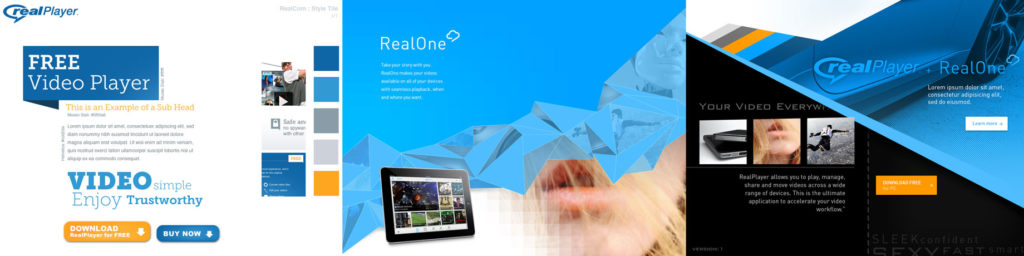
Real.com 2015
Stakeholder:
RealNetworks, employer from 2012-2015
Problem:
RealNetworks had developed a new cloud service to integrate into their canonical RealPlayer. This project started as an exploration into overhauling the brand under a new Marketing VP, but quickly turned into a platform for introducing a new product, which also went through two brand overhauls while the site was in production.
Goal:
Acquire users for a family-focused media storage product via a responsive, online, conversion funnel
Approach:
This effort began with an enormous amount of high-level concepting. Research had begun, but we didn’t have a fully baked product yet. After a series of surveys, an intensive round of ethnographic research, and a couple of rounds of focus groups, our target demographic changed drastically. Where RealPlayer had traditionally been sought by young males, the new product provided the most value to young mothers.
Once the product was defined, we were able to map it’s features to the needs of our new use-base and create a landing page and funnel that accommodated their needs. We were also able to begin wireframing and running those prototypes through user testing.
Development brought higher fidelity prototypes to test and also the chance to document our styles via the Bootstrap framework. By having design work directly with development, we were able to have a pattern library where every element was accounted for, and modularized, within the codebase. This was a significant help when the product branding pivoted twice in the coming year.
Results:
The final product was an easily edited and tested landing page and conversion funnel with a front-end framework that could easily be picked up by a new designer or developer.
Tools: Balsamiq, Sketch, Photoshop, HTML/CSS/Javascript, UserTesting.com
List Sharing
Stakeholder:
Amazon.com, RCX Intern in 2011
Problem:
The Wish List feature, which functions like an everyday registry, was a powerful shopping tool that was integrated across the shopping platform, but hardly discovered. Not only do Lists make users more comfortable engaging products, but they also make it easier to buy products for other people– however there was no way to let your friends know a list existed without sharing it with everyone.
Goals:
- Increase awareness of Wish List
- Add Wish List users
- Sell more products through Wish List
Approach:
This project was derived from research over the Wish List feature where users primarily showed concern over the fact that anyone could see a list if they made it. I altered the original implementation to include a “shared” state using patterns from other features that already existed on Amazon.com.
Result:
Today Wish Lists and their functionality are no secret, and the share feature is there to spread the word. It still functions as a link and not list, a technical limitation I ran into at the time.
Tools: Adobe Illustrator, Adobe Photoshop
Petition Flow
Client:
GreaterGood/Charity U.S.A
Problem:
With the overhaul of their ClickToGive sites, GreaterGood wanted to incorporate the same design system into their related properties. Petitions had more problems than branding though. Not only were they unusable on mobile, but they were difficult to scan, because of long sections necessary to the petition processes. To even sign a petition, users needed to complete a page long form.
Goals:
- Get more users through the petition process
- Get more users to return and complete more petitions
- Acquire brand-committed users
Approach:
I knew the petition experience had to be broken up and certain aspects of the single petition page had to be demoted visually, though still available. This as true on desktop and especially true on mobile. I also knew that having the right UI stick to the viewport would allow the semi-hidden pieces to become more discoverable and also increase conversions.
After wireframing, I used InVision to communicate my idea. Once approved, I was able to quickly fit the design into the existing Bootstrap framework, adding a few new elements.
Deliverables:
The front-end web code, fully responsive, for the petition experience– complete with a sticky petition “wizard” that loads with the individual petition page. The same flow sticks on desktop, along with a jump nav revealing the full petition text (which can be lengthy) and the signatures, both partially hidden.
Tools: Sketch, InVision, HTML/CSS/Javascript, Bootstrap
Framework for Network of Cause Websites
Client:
GreaterGood/Charity U.S.A.
Problem:
The existing customer experience for GreaterGood’s most popular nine sites was built on the cumulative outcomes of years of feature-centric A/B testing without considering where those priorities ranked. Without having taken a step back to gauge the whole experience, their “ClickToGive” acquisition opportunities had become scattershot pages of blinking gadgetry and competing content. The sites also failed to provide a mobile experience that allowed visitors to “click and give” with any ease.
Goal:
- Increase engagement with “Click to Give” CTAs
- Increase awareness of merchandise and other contribution streams
- Encourage return users
Approach:
With no research resources, but years of aggregated analytics, GreaterGood went into their redesign understanding what performed well and what didn’t. Weighing that performance against business goals, we underwent an intensive iteration cycle, where wireframes were used to explore the allotment of space per priority.
Once designed, I developed the front end of the experience using Bootstrap 3, ensuring the development team could easily navigate and alter the final deliverable.
Results:
The final deliverable was a fully responsive experience that allowed mobile users to quickly engage the brand. The design system baked into the framework mapped to existing brand guidelines for each cause, and allowed for the easy addition of new causes. Performance increased drastically, both in speed and search indexing, but also in engagement and with returning users.
Tools: Sketch, Adobe Photoshop, Adobe Illustrator, HTML/CSS/Javascript
Website Headers for 8 Local News Stations
Stakeholder:
ABC “Owned Television”, eight Major Local News Stations
Problem:
The headers topping our eight websites pushed content down the page in favor of links and graphics that were rarely engaged with and provided no perceived value, especially on pages where highly localized content was only relevant to a reduced segment of traffic.
Goals:
- Reduce the size of the header across screens, without damaging engagement
- Elevate the relevant content, especially on mobile post pages
- Increase video engagement
- Create opportunities for future personalization
Approach:
This project reached priority because of the significant amount of data that validated our assumptions. Concerns with the size and relevance of the header were presented as missed opportunities for the business, and that theory was proven by the low percentage of elements engaged in click-testing and by broad-reaching surveys conducted across our user base.
The CX team was also concerned with the number of out-of-region visitors being exposed to locally relevant content and links on high-traffic pages. Leveraging business goals and user interests, we aimed to meet in the middle, improving the experience for everyone in an iterative design cycle that took over a year. We began with simple A/B testing of contextual prompts for available video types, and ended with multiple tests of a complete header overhaul.
Deliverables:
From internal conversations about wireframes, testing of those wireframes, live prototypes of those wireframes, and then more wireframes, we reached a design that we were comfortable making available to a segment of our users. From that point we were able to reduce the links and graphics in the header, while increasing engagement, especially on the, now more prominent, video prompt.
Tools: Sketch, Adobe Illustrator, HTML/CSS/Javascript, Zeplin
Mobile Weather Experience for News Apps on iOS/Android
Stakeholder:
ABC Owned Local News Stations, employer from 2015- current
Problem:
The weather section in the existing news apps was static, having only been designed for the segment of users on iPhone 4s. The ecosystem had grown significantly and now presented users on a larger variety of screen size. It was also graphically heavy and stakeholders felt that it was outdated.
Goals:
- Elevate the information our users valued most
- Modernize the weather section and embolden the station’s brand
- Make more data available without complicating the experience
Approach:
We used this opportunity to put our existing app through user testing and find out what data user’s valued most. There was also interest in exploiting more of the API and giving more detailed weather insights, but I had to know where those ranked in user’s minds in order to create the most valuable layout and interactions.
After testing and collecting the station’s stakeholder’s goals, I reordered the tabs, having learned that, in most contexts, users prioritized the ten day forecast and relied on the detail in the text description. I then placed the most granular data in the last tab and in drawers relating to specific days certain users might be interested in.
Following the tabular data, I placed the video forecast(s) and access to the meteorologist’s graphics– which are preferred by a small, but active, user segment. The remaining sections were ordered by station interests.
Results:
The final design shipped with only high-level analytics available, but the weather section maintained its position as the most visited section of our app, and with only positive reviews.
Tools: Sketch, Adobe Photoshop, Principle
Amazon.com
In my time interning for the Retail Experience Team I contributed to the Wish List properties, the in-store property ,the browser plug-in, and registries. Very useful, and little known, tools.
-
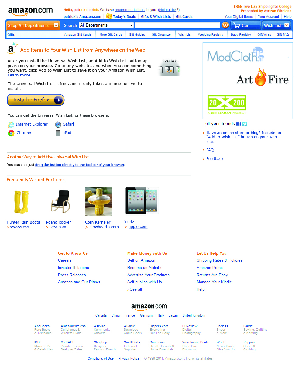
- The landing page for the Universal Wish List plug-in
-
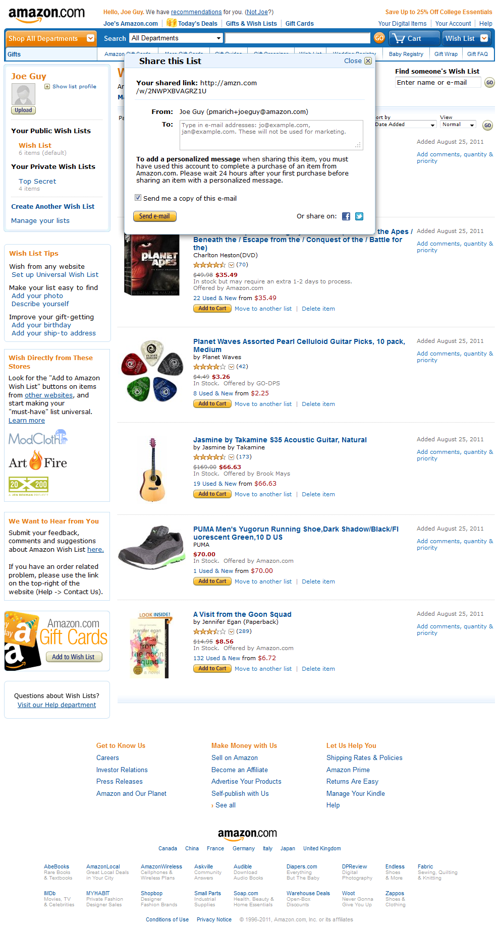
- A comp of a share modal and private list from a Wish List profile.
-
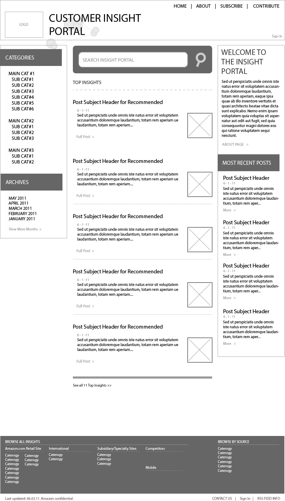
- Wireframe of CIP home page.
Start Ups & Non-profits
Since I first started designing and building for the web in 2009, I’ve worked with a number of start-up companies and non-profits. This usually starts with a design concept and ends with a WordPress CMS, or blog. I was with BigTip.com for over a year, working on a wider variety of projects.
-
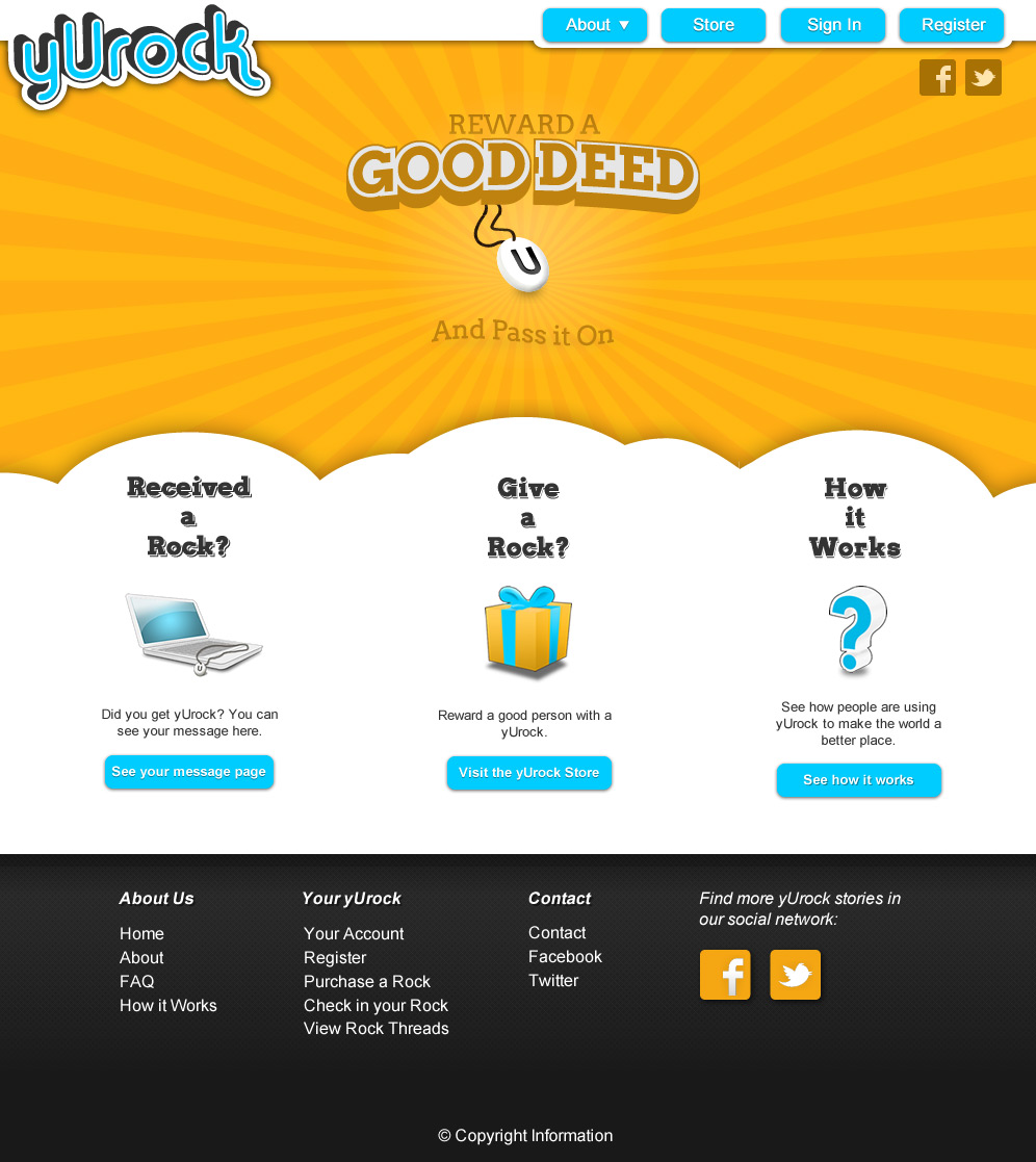
- yUrock.com website design
-
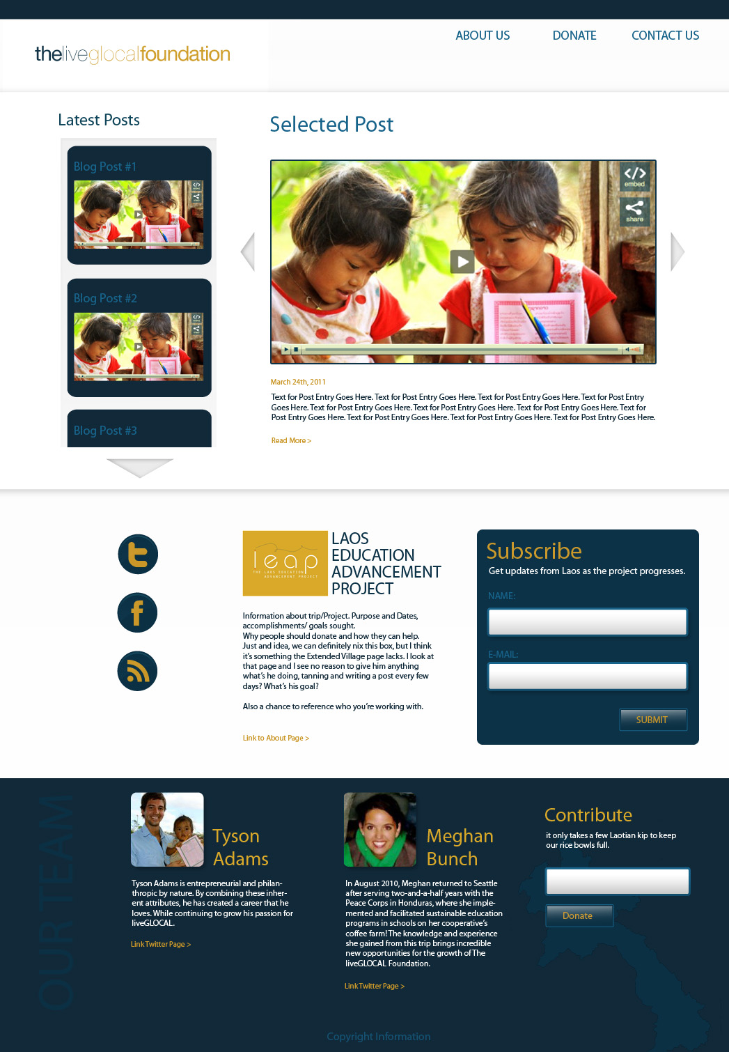
- A screenshot of the LiveGlocal Foundation’s home page
-
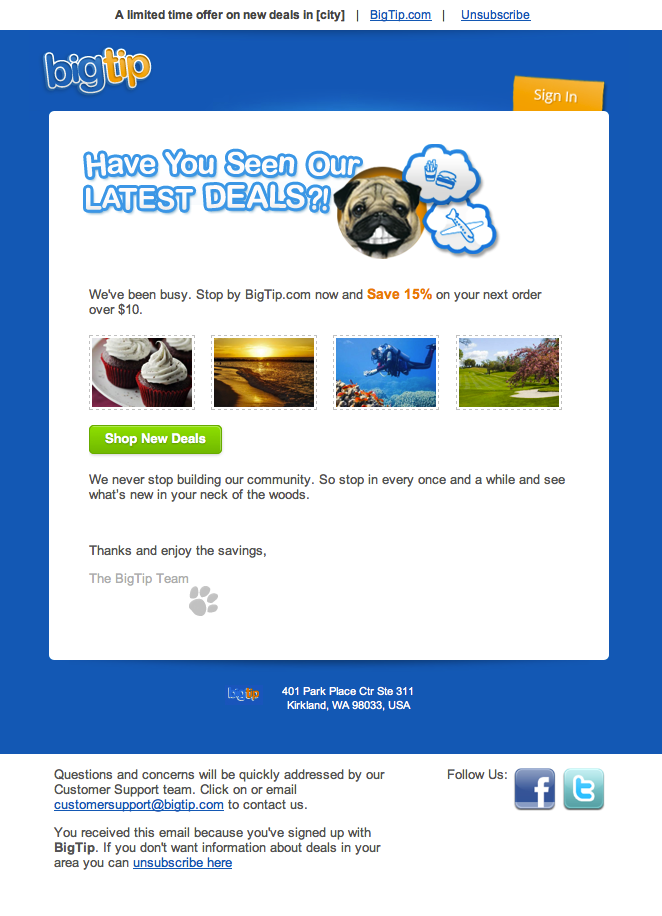
- BigTip email screenshot